Analytics
Your performance broken down: the equity curve, headline metrics, behavioral cuts, and execution quality, across your closed trades.
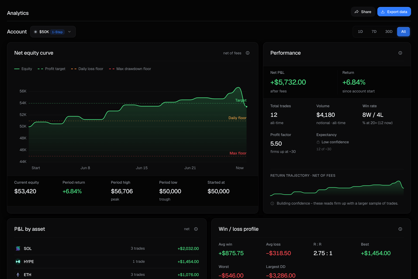
Analytics turns your closed trades into a performance breakdown: your equity over time, your headline numbers, how you trade cut different ways, and how well your orders filled. Everything on the page recomputes over the time range you pick.
One thing to know up front: a metric only prints a number once there are enough trades to make it meaningful. Below that, it shows a "building confidence" or "not enough trades" state instead, so a small early sample is never dressed up as a reliable statistic.
The time range
A filter across the top scopes the whole page to a window, so every metric and chart below reflects the same period.
| Range | Scope |
|---|---|
| 1D / 7D / 30D | Trades closed in the last day, week, or month. |
| All | Your full trade history. |
The equity curve
The headline chart plots your account equity over time, net of fees, with dashed lines marking your loss floors so your path sits against the levels that would breach the account. How those floors are measured is in Equity-based limits.
Performance metrics
Your headline numbers for the selected range.
| Metric | What it shows |
|---|---|
| Net P&L | Profit or loss after fees. |
| Period return | Net P&L as a percent of your starting balance. |
| Win rate | The share of trades that made money. |
| Profit factor | Gross profit divided by gross loss. Above 1.0 means winners outweigh losers. |
| Expectancy | The average result per trade. |
How you trade
Breakdowns that cut your trades by different dimensions, so you can see where your results come from.
| Panel | What it shows |
|---|---|
| P&L by asset | Your net result per market. |
| P&L by day of week | Which days you trade best. |
| Trade duration | How long you hold, and how that relates to results. |
| Direction and streaks | Your long-versus-short split and recent win/loss streaks. |
| Win / loss profile | The shape of your winners against your losers. |
Risk-adjusted and drawdown
The quality-of-returns view: not just how much you made, but how smoothly.
| Panel | What it shows |
|---|---|
| Risk-adjusted | Return measured against its volatility, so a steady curve scores better than a jumpy one. |
| Underwater | How far below your peak equity you have been, over time. |
| Daily P&L | A calendar of your day-by-day result. |
| After-cost performance | Your results with fees taken out, so the number is what you actually kept. |
Execution quality
How your orders actually filled, compared with the price you expected.
| Panel | What it shows |
|---|---|
| Slippage | How far your fills landed from the price you saw, on average. |
| Slippage by size and asset | The same, broken out by order size band and by market. |
Metrics appear once there is enough data
Analytics never shows a precise-looking statistic on a handful of trades. A metric that needs a larger sample stays in a "building confidence" or "not enough trades" state until you have closed enough trades for it to mean something, then fills in. So the more you trade, the more of the page unlocks.
A fresh account starts empty
Before you have closed any trades there is nothing to analyze, so the page shows a short empty state inviting you to start an evaluation. Your first closed trades populate it.
Related
- The Dashboard - your live account state and cushion, per account.
- Terminal - where the trades that feed Analytics are placed.
- The Rules - how equity and the loss floors are measured.